Beer With Awesome Labeling
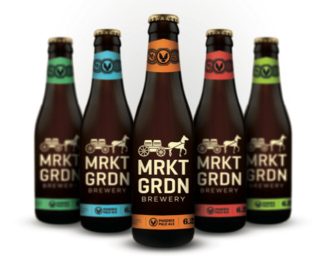
Market Garden Pale Ale
- With a bottle that is minimal, sleek, and gorgeous, this Cleveland brewery knows how to appeal to more than just the sense of taste. The contrast of the orange on the dark brown makes the Pale Ale particularly stand out.
.jpg)
Anchor Humming Ale
- Considering how played out the anchor iconography has become, Anchor Brewing has done a wondrous job of giving the classic imagery an updated and fresh look. Unfortunately, the taste of the beer doesn’t reach the bar that the packaging sets.
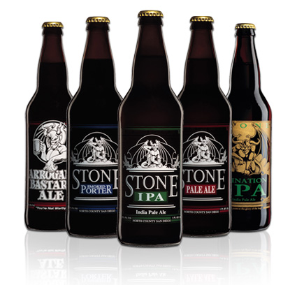
Stone IPA
- If it wasn’t enough that this is one of the best tasting IPAs around, the bottle and packaging are also some of the most aesthetically pleasing. Sure the write-ups are pretentious but if brewery has the right to be, it’s Stone.
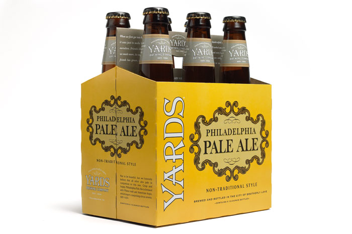
Yards Philadelphia Pale Ale
- Maybe it’s the Philadelphia bias speaking but nothing screams “classic” like the six-pack packaging of the Philly Pale Ale. The font, the use of space, the yellow and grey coloring… it’s all incredibly classy and elegant.
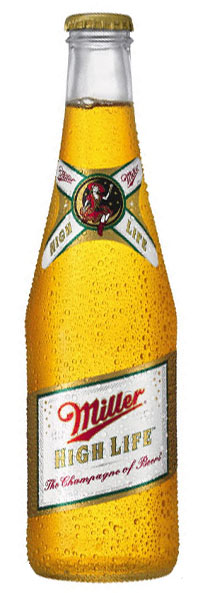
Miller High Life
- Cry all you want about the inclusion of a major corporation but the bottle and packaging of High Life really makes you believe (and hope) this stuff is the “champagne of beers”. A regrigerator full of the stuff is also a site to behold even if the payoff isn't next level.

Goose Island Pere Jacques
- Presented as if it were a bottle of wine, Goose Island’s Belgian-style ale’s labeling is incredibly simple but effective and makes one wonder if craft beer is finally begin to catch wine in the "classiness" category.
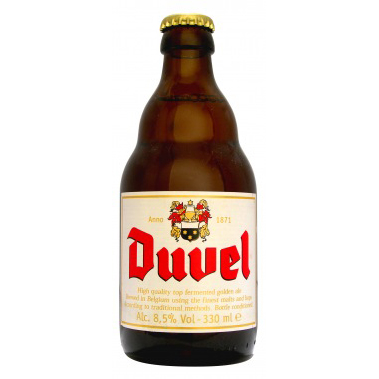
Duvel
- The unique, fattened, multi-leveled shape of the bottle has a lot to do with this one but the medieval-style font that frames the red “Duvel” overtop a white background is also striking and pleasing to the eye.
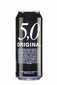
5,0 Original Pils
- White on black, straight to the point, and all text makes a good font choice imperative and Feldschloesschen was clearly up to the challenge.
Related Articles:


